Agentforce: AI Copilot & Text Generation
I led the Agentforce project for Salesforce’s site building tool, Experience Builder. This introduced AI chat and tools to our product. We’re now able to assist users with conversational AI and actions like Text Generation.
What is Experience Builder?
Experience Builder is Salesforce’s website builder. It has a drag and drop UI with OOTB components that makes building sites easy. Users can connect the Experience Builder to CMS and upload content in our headless CMS experience.
What’s the problem?

Currently, designing websites is time consuming and complex and has limited OOTB templates and branding, so users don’t have inspiration or a place to start.
To stay competitive, we need to consider how AI can advance website design in Experience Builder.
Persona & Jobs to be Done
“As a website builder, I want to create beautiful sites with ease and optimize AI for content creation so my users have a delightful experience visiting my website.”


Competitive Landscape
Our competitors are integrating AI into their products, with text generation and entire site generation at the forefront.
Competitors
Competitors like Wordpress, Wix, and Power Pages, are already leading in AI Text Generation.
We drew inspiration from their various AI applications, embedded and AI chat UI’s, and required details for creating accurate and customizable text.


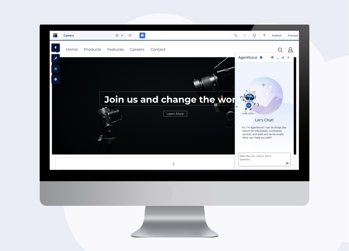
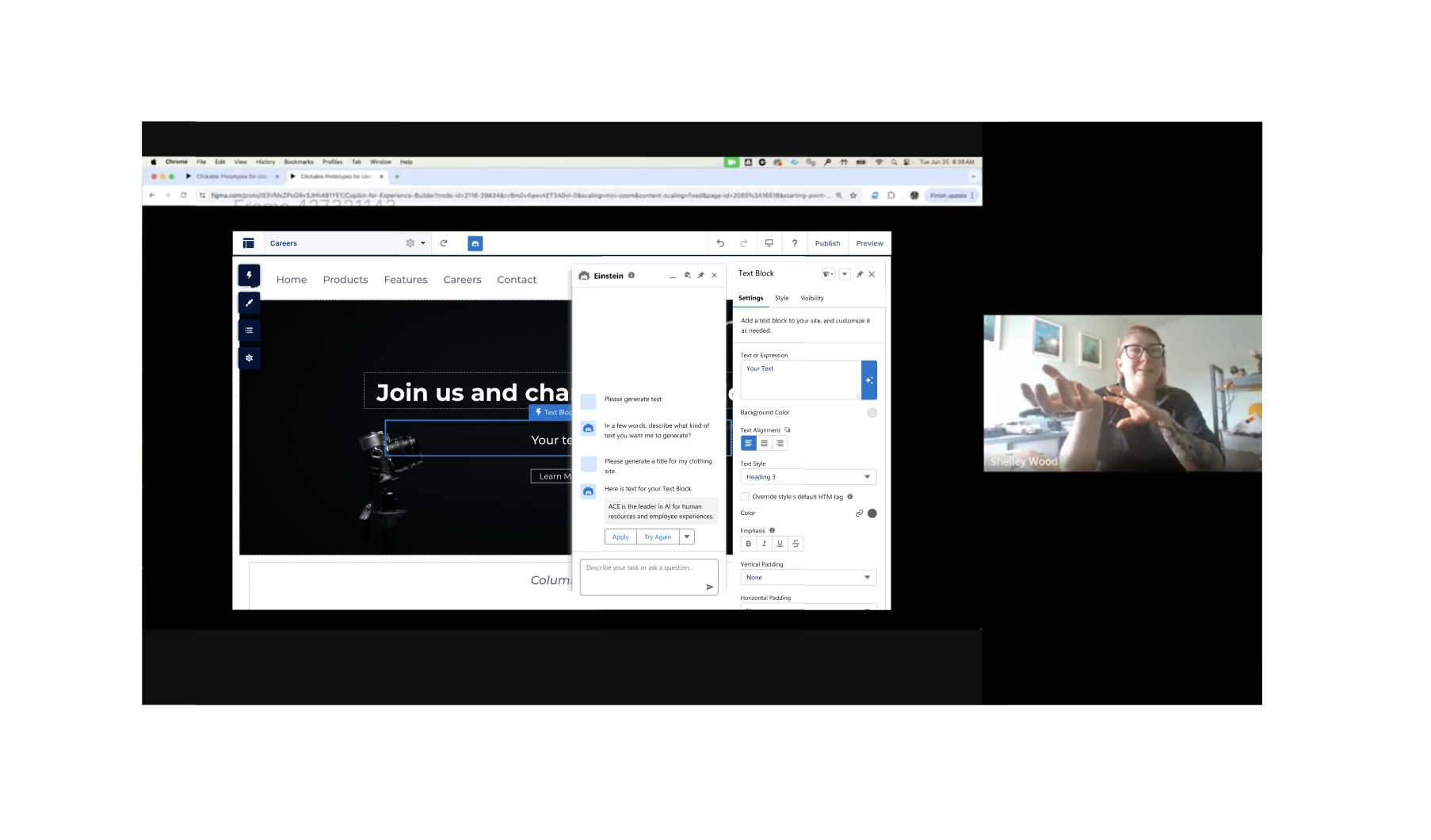
Initial UX
My initial design showcases our Salesforce branded sparkle button in the property panel of our Text Block component. The button prompts an AI Copilot panel to open so Agentforce can assist with text generation.
Considerations:
I needed to abide by Salesforce’s GenAI pattern library, which guided much of the UI patterns and branding
Docking our property panel was necessary, but there was push back that it would exceed our bandwidth
User Testing
Key Objectives
Is the Text Generation UI intuitive, discoverable, and delightful?
How do users feel about the canvas experience with 2 panels now coexisting?
Do users prefer when both panels are floating or when both or one panel is docked?
Methodology
I conducted 8 user interviews with
External participants with web design background
Internal Solution Engineers who work with our product customers
These were 1:1 interviews, approximately 1 hour each.
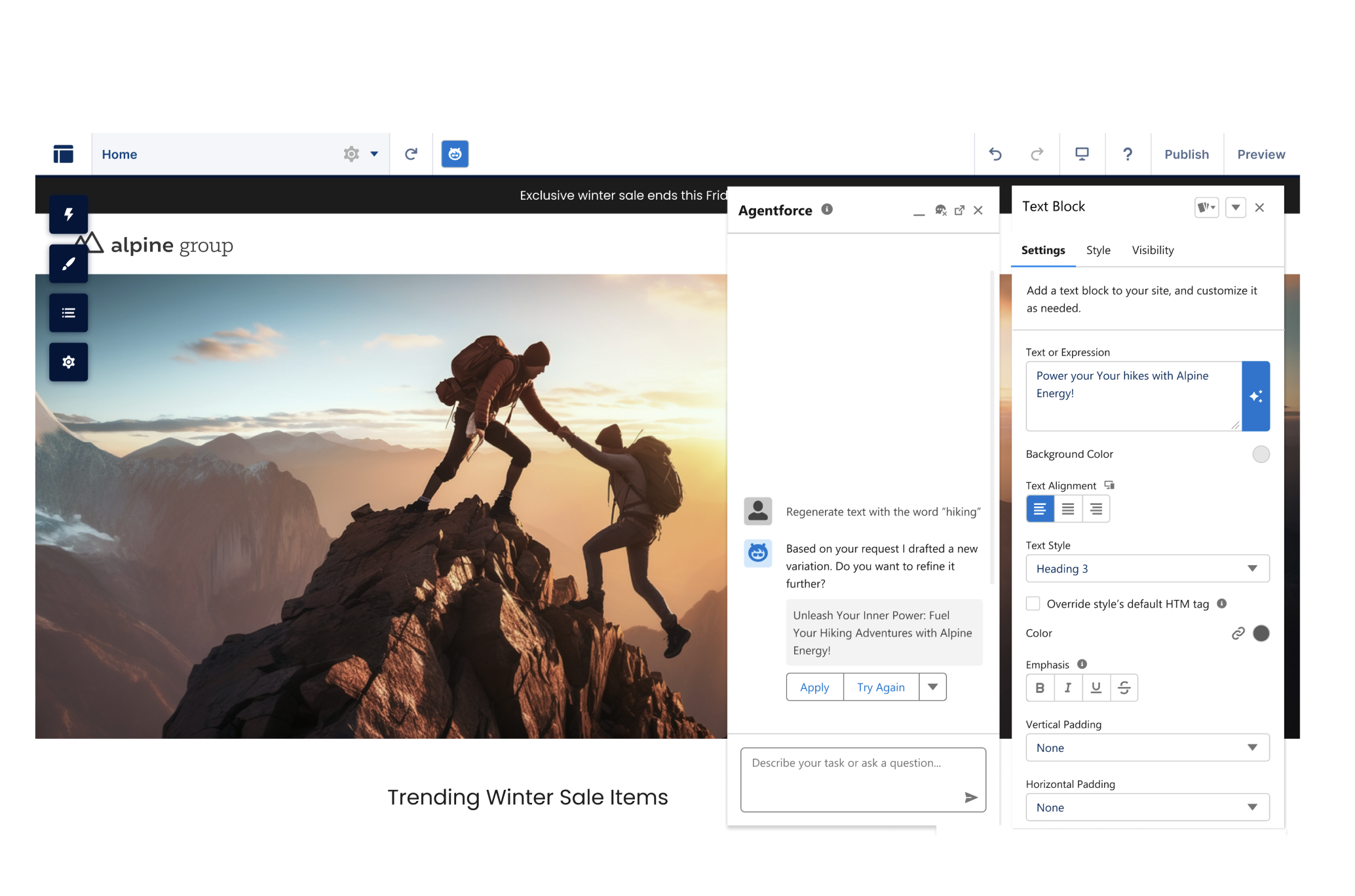
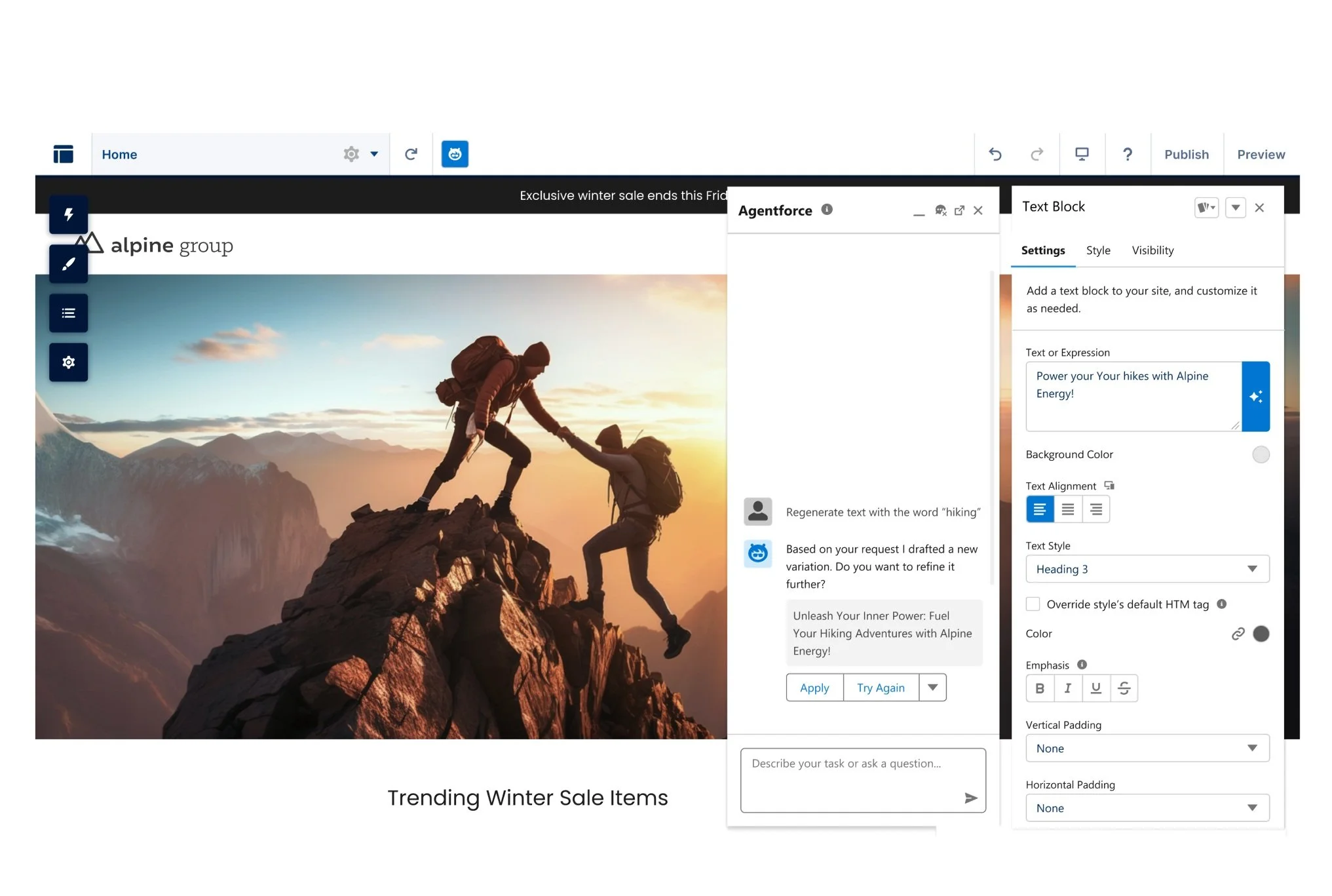
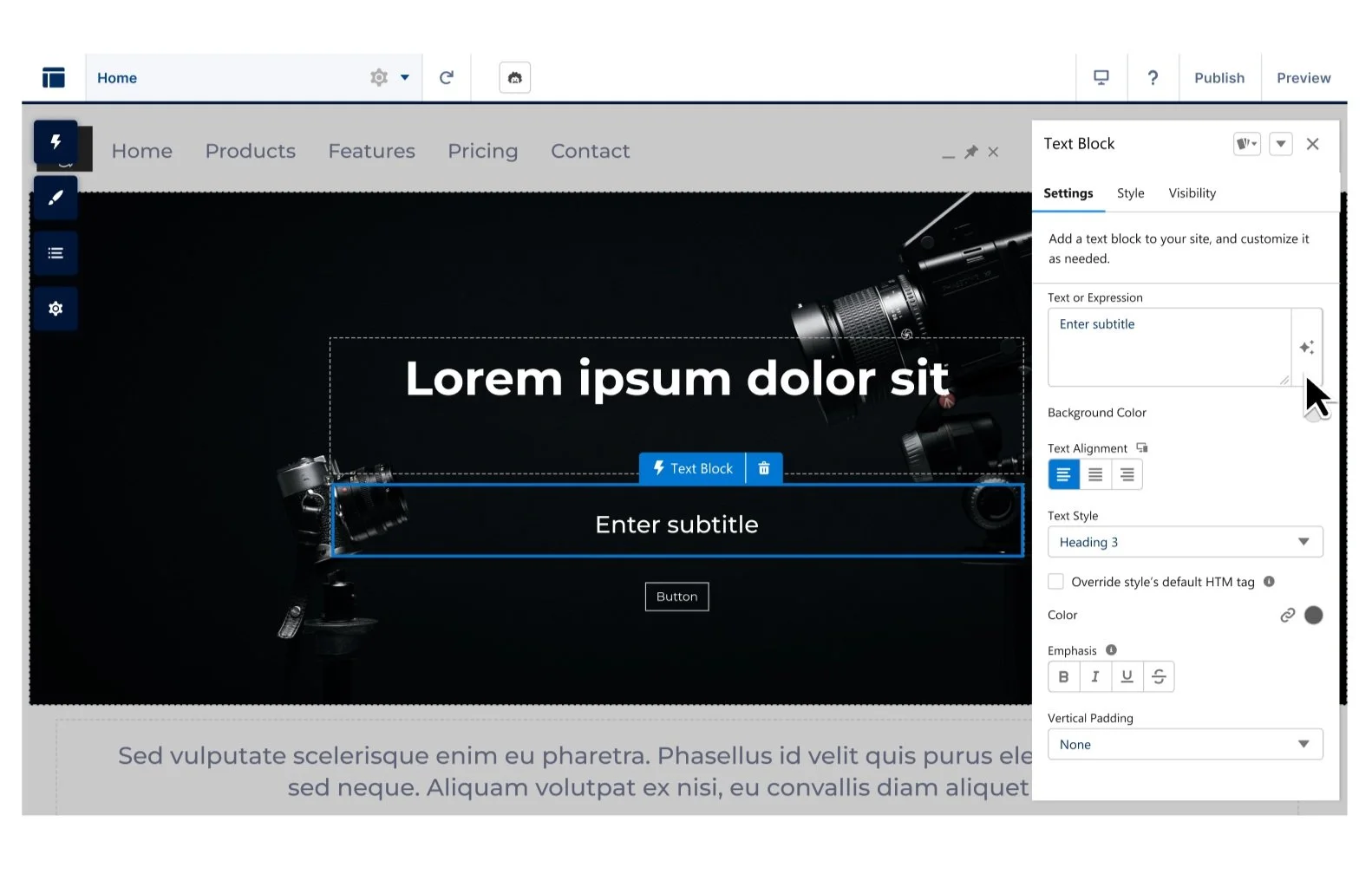
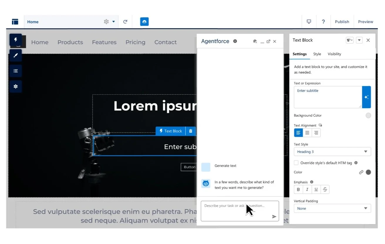
Part 1: AI Text Generation
Users click through the user flow for adding a Text Block component, then prompting AI text generation through Agentforce. They explore revising tone and length of the generated text and apply it to their site.

Part 2: AB Testing for Panel Interaction
A: Property Panel and Agentforce Float only. No panel docking.

Pros
Less engineering effort
Wider canvas view
Faster release of Agentforce
Cons
Panels blocks 50% of canvas
Users have less options for panel interaction/canvas view
Slows user by making them manually move panels while building sites
B: Property Panel always docked. Agentforce Floats/Docks.
Pros
Users have more options for panel interaction/canvas view
Fewer clicks to move panels out of the way
Increased canvas visibility
Users can choose various canvas views based on a task they’re completing
Cons
Canvas is mobile responsive (tablet view) when both panels are docked - inconsistent with desktop properties in property panel.
Canvas is narrower as more panels are docked.
Takeaways from Usertesting 📈
Users were 50/50 on docking one panel or having both panels floating. Preference based on device type and what task they were doing in Builder.
Users understood the sparkle button UI in the text block component and found text generation valuable.
0 users liked the experience where both panels were docked because it made the canvas too narrow and didn’t representative a desktop view.
Users found the initial size of the Agentforce panel “jarring” and too large.
Users were confused about the original “new window” icon and thought it ejected the AI chat in a new window/tab.
Iterations
Given my user testing feedback, I made the following changes, inspiring new updates in Salesforce’s Agentforce Pattern Library.
Ability to resize the Agentforce panel height
Reduce initial height of the Agentforce panel to 620 px in Experience Builder
Enabled docking and floating for both the property panel and Agentforce panel
Allow docking for only one panel at a time to prevent confusion when both are docked (canvas reduced to mobile view)
Replace old icons with a pin icon to clearly communicate docking function
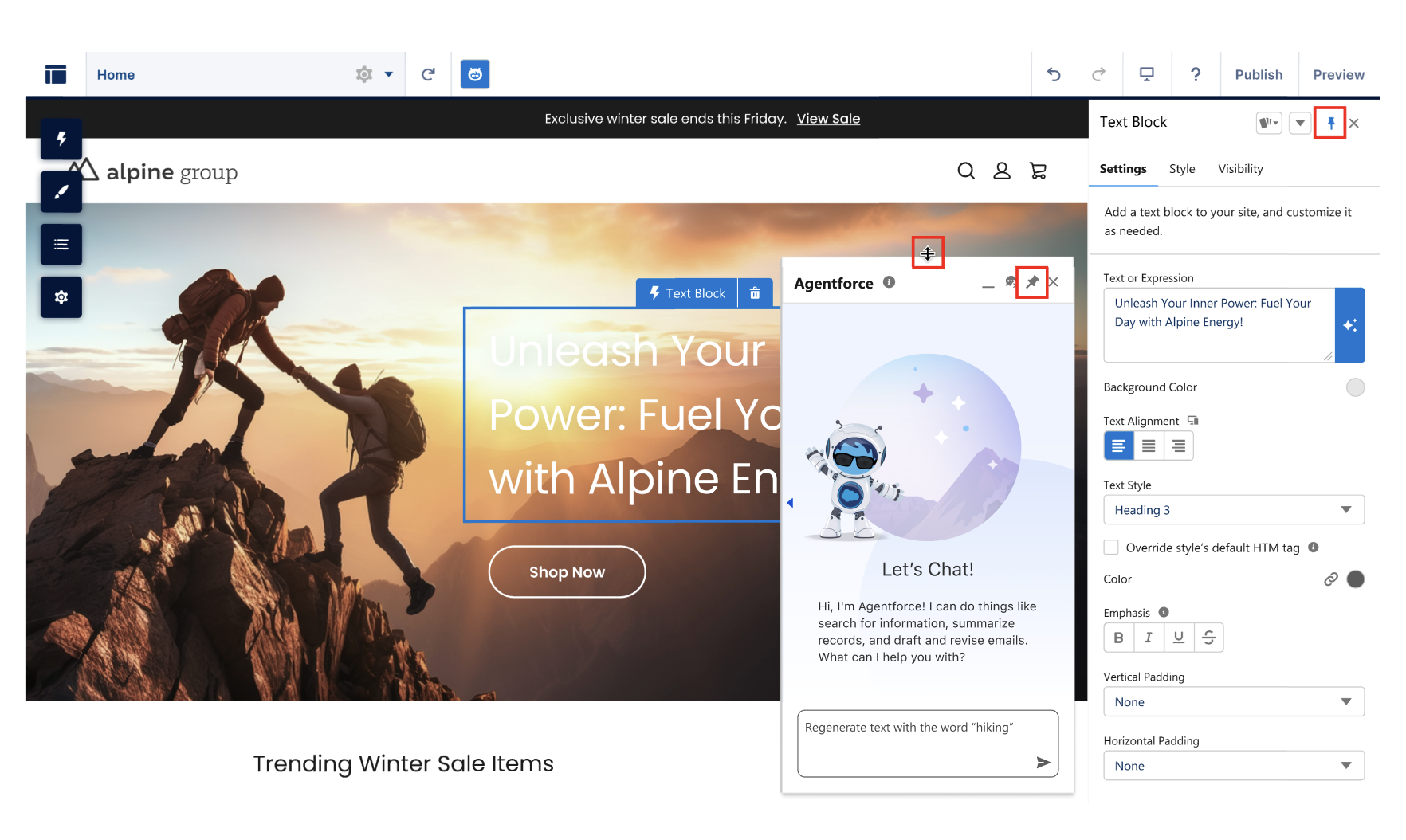
Final UX: Agentforce for Experience Builder
Project Impact
-

Inluencing the Roadmap
Despite urges to rush Agentforce’s launch, I swayed my team to prioritize making our property panel dockable before building Agentforce. It extended the timeline but enabled us to resolve a long known gap and create a seamless UX that better supports AI.
-

Innovating Patterns
Although using Salesforce patterns is enforced, our library is still a living document that I changed and inspired it with newly surfaced needs and ideas. My research led to new features for our GenAI Pattern Library, including resizing the panel and icon updates.
-

Building Unified Solutions
In usertesting, participants often lean more heavily one way than another, causing data trends to emerge. But other times, users are split 50/50. In this project, I reworked my solution to be flexible and to cater to more user needs, increasing overall satisfaction.
What Next?
Experience Builder now has a dockable property panel that brings delight and ease of use to our users.
Text Generation (Pilot) is now being engineered for Builder and can assist users with creative paragraphs and titles.
Next, Agentforce will be used to generate whole sites and enhance Search Input and Results components with AI search summaries and multi-turn actions in search.